Lead Gen and Website Performance Soars Since Utopia's Launch

An overview of how we helped:
-
135% surge in website traffic
-
61% increase in new contacts
-
153% increase in contacts assigned to Sales team

Introduction
Utopia Global, Inc. helps enterprise organizations leverage their SAP investments by understanding, fixing, and governing their data. With clean data, enterprise organizations are able to make smarter decisions than ever before.
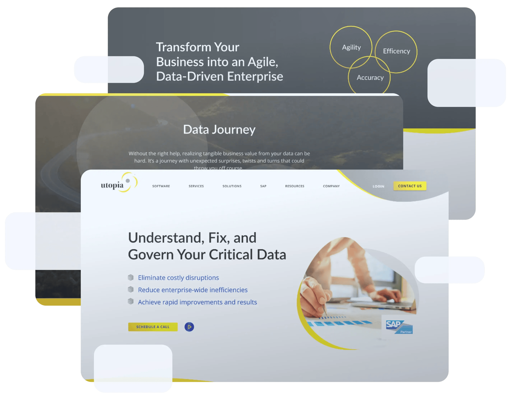
Utopia came to Web Canopy looking for a new website that had a clean, modern aesthetic and converted web traffic into quality leads.
The challenge

Old, Outdated Design
Before starting this project, Utopia hadn't done a website refresh in well over 5 years, so the website had an outdated look and feel that didn't capture the modern, innovative solutions for which Utopia is globally recognized .
Not Optimized for Conversion
The old website had very few CTAs and as a result, the website wasn't converting many inbound leads. There wasn't a clear path for users to follow.
Overwhelming Navigation
The header navigation had an overwhelming number of dropdown options, which made it hard for visitors to get the answers they needed.

The new website

Clarity in Layout and design
The old website used a ton of industry-specific terminology and "jargony" language - and presented it in a really poor way. The density of information was so high that it was hard to read.
So, we made sure the information was presented simply and that the information hierarchy was laid out in a meaningful way.

Streamlined Navigation
We took a lot of time to be thoughtful about the navigation so that our visitors wouldn't be overwhelmed by the options. It meant taking a hard look at the site and see how the presentation could be simplified.

Forrester Calculator Integration
Utopia had the opportunity to leverage their partnership with Forrester Research to build an integration. Forrester hosts an ROI calculator on their site that Utopia prospects can use, and Utopia gets the leads as they come in.
To do that, we created a hidden field on a form that pulls a UTM tracking code and sends a URL as a query string parameter.

Conversion Points at Every Opportunity
Our priority was to turn site visitors into leads - so we made sure every single page had a CTA that was relevant to the information that was being presented.

The Path To Success

Targeted Reference Content
At the bottom of each page, we have that resources section that offers additional content. There are two versions of the module - one automatically pulling from the blog and one where resources are manually inserted.

CTAs Front and Center
We've got content offers and CTAs strategically placed throughout the site, which provides a more seamless user experience and more conversions across the board.

Keyword-driven copywriting
Utopia is speaking to a sophisticated target audience that speaks a very specific language, so we did the keyword research to make sure that the content on the website attracted the right visitors.

How HubSpot was utilized
-
Lists: Segmented their learners using the lists tool as they engage
-
Workflows: Triggered workflows for notifications and nurturing when a form is submitted
-
CMS: Website Pages, Landing Pages, Blog, Design Manager
-
Email: Follow up emails and nurturing emails created for lead engagement
-
Lead Capture: Unique CTAs on all course pages, popups, customized forms
-
Campaigns: Organized all new website activity into campaign
-
Reporting Tools: Analyzing performance using HubSpot's reporting tool
-
UTM Connection with Forrester: This has allowed them to work with their partner Forrester hassle-free by using tools provided by HubSpot.
T H E R E S U L T S
Utopia Global Sees 114% Traffic Growth and 61% Conversion Boost with Web Canopy—See How You Can Too!
Web Traffic Soars
Website sessions have more than doubled (114% growth) which means more people than ever are finding Utopia's website.

On-Site Engagement Increases
Page views per session and average time on page are up across the board - and bounce rate is down.![]()
![]()

Conversions Through the roof
Conversions have increased by 61% since the site launched!
Even better, There have been 1039 inbound contacts created in the two previous entire YEARS, and the new website has generated 200 new contacts just in the past 90 days!
Sales opportunities created
The contacts being assigned to the Sales team has more than doubled over the past 90 days.


"I would recommend Web Canopy to all small- and medium-sized businesses. They are our vendor of choice... They've proven their trusted thought leadership and expertise and most importantly, they've already driven results."
Tom Martin
Head of Global Marketing
Need to see these kinds of results?
If you are struggling with your website and you're concerned about how to make it truly act as an extension of your marketing and sales team, please know that we are here to answer any questions you may have and guide you through the process.
Let's have a discussion about how to really make your website work for you.