You want your text to make a huge impact.
As a web designer, I’ve come across many a stumbling block when it comes to entering proper website content for a client’s new site. When we build your site, we want to know exactly what content goes on which page so we can gauge how it will look. As your developer, our goal is to make your site as visually appealing and aesthetically pleasing as possible. As such, here are a few suggestions we'd like to recommnend:
1. Supply us with more than you think we need.

It’s always best to have too much information than to be stuck with too little to work with. I’m a web designer. That’s my field. So, when it comes to filling in pages with information about your company, business, and line of work, there is no better mind to fill in the blanks than yours. Dedicating an entire page to a single paragraph of content seems such a waste. By supplying us with a copious amount of content, you’re saving both of us significant amounts of time.
Do you want to tell the visitors about your facility? Your staff? Your product? Keep these kinds of categories in mind so you know you're conveying everything you want your visitors to know. If you do come up with too much content and you're not sure what can go on a page without mucking it up and making it too busy, that's where we come in. We'll be able to arrange your excess of information in ways that will attract the visitor's eye and get your message across.
When it comes time to maintain your site and update the information on each page, it once again saves us all time if you give us everything at once. By allowing us to set aside a single block of time to fill in all of your pages with new content, we’re able to expedite the project and have you happy by the end of the day. That’s something I’ve always personally prefered to minimal updates dribbled and scattered throughout a week.
2. Please edit your content.
Editing content is not my role unless it is explicitly agreed upon between us. You pay me for my time adding your content to your site. You may not also want to have to pay me for reading through your content with a critical eye, searching for every minute detail. Grammar and spelling errors trip people up when reading, and that’s why - truth be told - I encourage web developers not to read the content submitted to them by their clients unless that is clearly part of the agreed upon scope of work.
You may find it difficult to believe how many times I have stumbled upon grammatical mistakes in the blocks of content submitted by clients. However, there is nothing I can do. As a means to avoid liability, my job is literally to copy/paste to your site whatever it is you send to us. I understand that sounds like a copout, but it serves as a means to prevent us from slipping up and missing a typo that we personally make. Further, if we start editing your content we may delete or alter something that seems inoccuous to us but is crucial to your business or message. You are the experts in your business, and we are the experts in getting your business online.
Remember that you pay us for time spent on your site, and if we have to return to your site repeatedly to correct a mistake on every page each time more content is submitted, the time and cost really adds up, and that’s something we imagine you would like to avoid.
3. Keep it unformatted.
 Believe it or not, I prefer using a simple text editor for data insertion. All the formatting you apply in Word ends up as wasted time. When my development platform tries to decipher the formatting in pasted text, things get ugly quickly. So, either I have to go back and fix the formatting or simply rip the formatting prior to inserting content, which is what we do. All of the effort that went into prettifying what you gave me is completely useless, and we value your time as much as you value ours.
Just remember that it’s our job to make it pretty so you don’t have to.
I understand that most of this could be considered nitpicky, but it really is a way to save both of us time and, ultimately, protect your pocketbook. By supplying us with an overwhelming amount of properly edited, unformatted content, we’re able to zip in and zip out of your site with ease, keeping our schedule clear to keep all of our clients happy.
Check out my next blog in this series: Delivering Quality Website Graphics
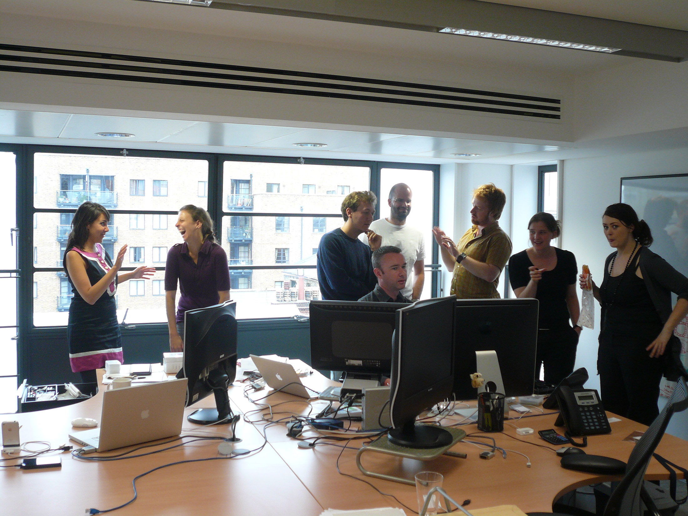
Photo credit goes to Flickr user Lars Plougmann


