This post is intended to highlight the use of tables in your website and why they don't work well with mobile devices.
Phones Should Go On Tables... Not The Other Way Around
I know what you're thinking... this guys likes using ellipses a bit too much, and it's hard not to use tables if you have a ton of product information to show off.
You're right, I tend to overuse ellipses a little bit...
I'm not denying the usefulness of tables and their ability to illustrate a lot of information all in one place. What I'm pointing out is their inability to do so across multiple screen sizes.

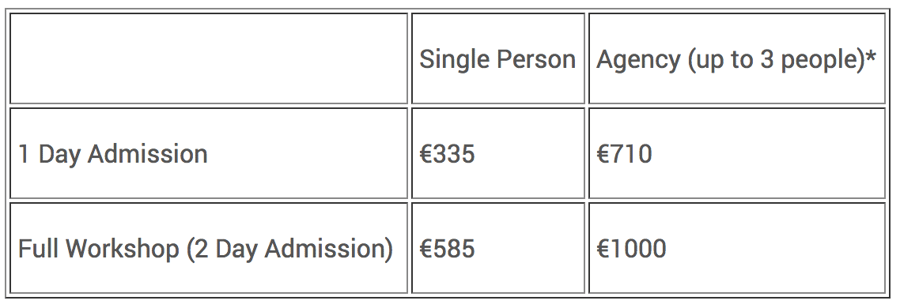
(pictured above - what a table looks like)
I don't know why, but so many of the projects we work on come to us with extensive, multi-column tables. tables on mobile are hard to read, hard to use, and are not search engine friendly. These just don't function well in our world for one primary reason:
Tables don't transfer to smaller screens very well.
This statement actually makes sense simply because tables were used on websites long before cell phones became "smart."
Simply put, tables were built for a different generation of websites and computers.
Recommended: 5 Easy Hacks To Win More Business On Your Website
They were not meant to be used on devices with screens as small the ones on our tablets and smart phones.
The main functionality of tables are to span across the space that they exist in, not shrink to fit to that space.
This is why tables look fantastic on Desktop view.
They have nothing to worry about on bigger screens! But the moment that screen starts to shrink, the table will start to drift off out of view, doing exactly what it was built to do.
What can I use instead of tables to build a website for desktop and mobile?
I've heard mention of a term called "Mobilegeddon" which signifies that older websites built on tables may face problems with the introduction of much smaller "computers" into the world.
With the rapid change in technology that we've experienced over the years, a change in how websites are built must happen as well.
One such pioneer in this endeavor toward website betterment is HubSpot, along with their phenomenal WYSIWYG editor inside their COS.
With this feature available on Rich Text modules, and the flexibility to have multiple Rich Text modules next to each other on a website template, tables are no longer necessary.
This is due to the "Span" system that HubSpot is built on.
Simply put, each module exists on its own span, and these spans are designed to shrink in width as the screen gets smaller, and to drop to the next line when a row gets too crowded.
These are the 2 capabilities that separate tables from being able to work in a mobile-centric world.
When in doubt, rely on rich text modules and pile as much content into these as possible instead of going through the hassle of building massive tables.
It is extremely unfortunate that tables are not able to resize with screens since they look so nice on a desktop computer!
The world is shifting heavily towards a mobile-first economy.
Let's make sure we're ready to highlight that change.


