As a marketer, you may have heard the term "landing page" before. But what exactly is a landing page, and why is it important for your business? In this guide, we'll dive into everything you need to know (and more!) about the definition of a landing page, what they are not, why landing pages are a critical component to your lead generation, common landing page myths, landing page best practices and more! If you’re new to HubSpot and you need to convert more leads, or even if you’re a seasoned digital marketer that needs a quick refresher, this is your complete guide to building the most effective landing pages.
IN THIS GUIDE, WE DISCUSS:
- What Is a Landing Page?
- The Difference Between a Landing Page and a Website Page
- Types of Landing Pages
- Lead Capture Tools on Landing Pages
- The Essential Elements of an Effective Landing Page
- What Is a HubSpot Landing Page?
- Key Features of HubSpot Landing Pages
- HubSpot Landing Page Best Practices
- How to Build a Landing Page on HubSpot
- Why You Need Landing Pages
What Is A Landing Page?
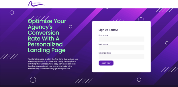
Definition: A landing page is a standalone page on your website that's designed to collect visitor information that is freely given in exchange for something of value. This is usually done through a form submission of some kind, and is most commonly used to convert visitors into leads or customers. Unlike other pages on a website, an optimized landing page has a specific goal of getting a visitor to take action, like filling out a form or engaging with an interactive lead capture tool (think calculators, quizzes, etc.).
The purpose of landing pages vary, but generally they are used to capture visitor information (for example, an email address, contact name, and company are quite common form fields you might see on a landing page), and act as the “gate” to what is often referred to as “gated content,” or, content that is only available after a lead form is submitted.
The Difference Between A Landing Page and a Website Page
It can be very confusing to hear the different terms associated with pages on a website. You might hear terms like sales page, squeeze page, website page, opt-in page, or home page, and feel completely lost. You’re not alone!
It's worth noting that a landing page is not the same thing as a home page in most cases. A home page is commonly confused with the term “landing page” because it might be the first web page someone “lands” on when they hit your site. In that context, technically that is true–it is a landing page.
However, a home page is most often designed to provide an overview of a website and direct visitors to various sections of the site, while a landing page most often has a specific purpose of getting a visitor to fill out a form and is intentionally optimized for conversion.
So what about other pages on the website? Are those landing pages or website pages? Let’s take a closer look.
In HubSpot terminology, website pages are the core pages on your website that talk about your products, services, company, and more. It is a tool specifically built on CMS Hub to allow your company to utilize custom or pre-built themes to build out your overall site.
Landing pages are a separate tool inside HubSpot (which is also available in CMS Hub, as well as other Hubs) that exist as that lead generation engine your company thrives on.
Likewise, A landing page is also not a blog post or article that's intended to inform or educate visitors. Blogs are a separate tool inside HubSpot, and often include a link or CTA which guides readers to a landing page to download or engage with a specific offer.
The primary difference between a landing page and a website page is that the former is designed with a specific purpose in mind for conversion. This makes optimized landing pages a powerful tool for generating leads and sales.
Types of Landing Pages
Landing pages can be used for a variety of purposes, from lead generation, to lead nurturing, to customer re-engagment, and even for driving sales. They can be used for lead magnets and top-of-funnel offers, such as checklists and guides. They can be also be used for bottom-of-funnel offers, such as demo requests and contact forms. These pages take on a variety of forms depending on a number of variables that include but are not limited to:
-
Sources or intent of traffic (did the traffic come from ads, email, etc.)
-
Purpose of the CTA or call-to-action (subscribe to mailing list, get a coupon, download a checklist, demo request, etc.)
-
Stage in the customer journey (top of funnel, middle of funnel, bottom of funnel)
Other platforms use different terminology, but generally we see the following primary types of landing pages:
Squeeze Page
A “squeeze page” is a type of highly effective landing page design that's built to capture a visitor's email address or other contact information. It is called a "squeeze" page because its primary purpose is to squeeze out contact information from the visitor in exchange for something of value, such as an ebook or white paper. Squeeze pages are often simpler in design with a clear call-to-action and are used to build email lists for lead nurturing and sales. Generally these are bit more aggressive in copy and tone. These are pretty common pages used for what is commonly referred to as a “lead magnet” because it attracts your visitors to convert and become a lead. In some cases, this could be shortened to a simple pop up form as an exit-intent lead capture strategy.
Opt-In Page
An “opt-in page,” on the other hand, is a very similar landing page type, but varies primarily on the intent of the page. These are designed to encourage visitors to “opt-in” to your email list by providing something of value. Opt-in pages are often longer and more detailed than squeeze pages, with persuasive copy and high-quality visuals that provide the visitor with a better understanding of the value they'll receive in exchange for their contact information. The main difference between a squeeze page and an opt-in page is the approach used to obtain the visitor's contact information.
Sales Page
A “sales page” is a type of landing page that is specifically designed to promote and sell a product or service. The primary goal of a sales page is to persuade the visitor to make a purchase by providing them with compelling copy, high-quality visuals, and a clear call-to-action. Unlike other types of landing pages, sales pages are often longer in length and contain a VSL (video sales letter) and/or a written sales letter. They typically also include customer testimonials, product features, and product benefits, as well as pricing information. Sales pages are an effective tool for driving sales and can be used as part of a sales funnel to move visitors towards a purchase.
Demo Page
A "get a demo" page is a type of landing page that is specifically designed to promote and schedule a product or service demo. The primary goal of a "get a demo" page is to encourage visitors to request a demo of your product or service in order to learn more about its features, benefits, and functionality. These types of landing pages are often used for B2B businesses that offer complex products or services, as a demo is an effective way to showcase the value of the product or service.
Contact Page
A "contact us" page is a section of a website that is specifically designed to allow visitors to get in touch with a business or organization. This is what most companies use today as a primary contact form on their website. This page generally has other information on how to contact a business, like phone number, address, location, hours, etc. While it is an important part of a website, it is generally the most spam-heavy area of your business and can quickly flood your company with unnecessary requests for information.
Lead Capture Tools On Landing Pages
A landing page won’t be able to help us capture leads if we don’t have a tool in place to make this happen. We’ve covered the different kinds of pages you can create, but what do you need to think about in terms of using the right kind of tools to capture those leads?
There are several kinds of tools you can use, but the most common format you see today are forms and chatbots. I’ll explain:
Form Tools
Forms are typically the most common type of lead capture tool you see today. Chances are, you’ve filled out a form online within the last 24 hours! They allow you to collect visitor information in exchange for your offer, such as an ebook or white paper. Forms are typically located above the fold of the landing page, and they should be simple and easy to fill out. The fewer form fields you have, the more likely visitors are to complete the form, because when we ask lots of questions we create lots of friction. It's important to ensure that the form fields are relevant to the offer and that the required fields are clearly marked.
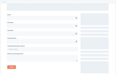
If you’re not using HubSpot and need to explore other tools to build your landing page forms, here is a quick list of resources to check out:
Chatbot Tools
Chatbots are another type of lead capture tool that can be used on landing pages. They provide a conversational interface that allows visitors to answer a series of questions (or ask a series of questions) and receive answers in real-time. Chatbots can be especially effective for businesses that offer complex products or services, as they can provide personalized assistance to visitors. Chatbots can also be used to collect visitor information, such as their name and email address, and move them closer to a sale.
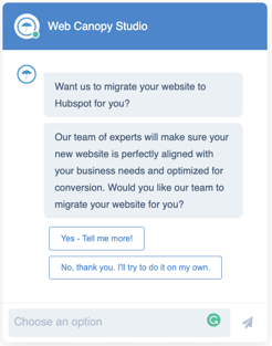
If you’re not using HubSpot and you want to see what options are available for chatbot tools, here is a quick list to get your search started:
Whichever lead capture tool you choose to use on your landing page, it's important to ensure that it's optimized for conversion. This means that it should be easy to use, visually appealing, and located in a prominent location on the landing page. It's also important to ensure that your lead capture tool is integrated with your marketing automation system, so you can follow up with leads and track their progress down the funnel.
You also want to think about what your audience is most likely to engage with. If your audience is more likely to have an aversion to engaging with a chatbot, then you probably don’t want to go down that route.
The Essential Elements Of An Effective Landing Page
For most marketers, building a landing page will follow a similar template or style. Here are the essential elements that every landing page should contain when focusing on lead generation:
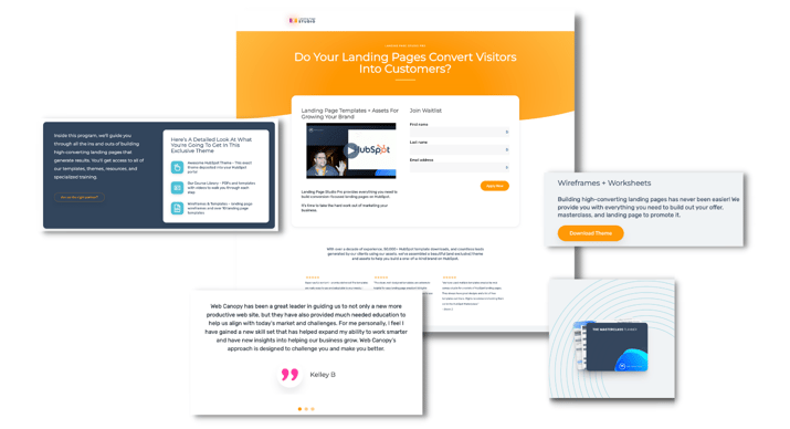
1. Headline
The headline is the first thing visitors see when they land on your page, and it's critical to grab their attention and communicate the value proposition of your offer. A compelling headline should be clear, concise, and to the point. The most important thing about your headline is that it must match the same message that brought your visitor to the page in the first place.
2. Copy
The copy on your landing page should be persuasive. It should emphasize the benefits of the offer and address visitors' pain points. Your copy should be written with your target audience in mind and should clearly communicate the value of the offer. When evaluating copywriting examples from businesses, a pattern usually emerges in the most successful (in terms of conversion rate) brands. This is because they have a benefit focused headline and a clear call to action button, and they keep the length of the text as minimal as possible. It should be noted that this is specific to web pages and not within your landing page design. Keep in mind that visitors will likely only skim your page, so make sure your copy is easy to read and highlights the most important information. Use subheadings, bullet points, and short paragraphs to break up the text and make it more scannable.
3. Visuals
High-quality visuals are essential to support the copy and help visitors visualize the offer. The visuals you use should be relevant to your offer and should help visitors understand the value of what you're offering. You can use images, videos, infographics, or other visual content to help explain the benefits of your offer and make it more appealing to visitors. Pro tip: use visuals that show your visitors “desired state,” which is the state they wish to see themselves in. Your offer should convey a feeling that by engaging with you, this is the state you can help them achieve.
4. Form
The form on your landing page should be simple and easy-to-use. It should collect visitors' information in exchange for the offer. Keep the form fields to a minimum, only asking for information that's necessary to fulfill the offer. The fewer form fields you have, the more likely visitors are to complete the form. Make sure that the form is easy to locate and that it's clear what visitors need to do to complete it.
5. CTA
The call-to-action (CTA) on your landing page is the button or link that tells visitors what to do next. In most cases, it should literally just tell people to fill out the form! Surprisingly, humans don’t typically take action unless someone tells them or shows them what to do. Your CTA is to tell your visitors to “fill out the form to access your template,” or something similar.
6. Social Proof
No one will give more value to your brand than others who have already trusted you and said “yes” to your company or your offer. Social proof is a powerful tool to build trust with visitors and encourage them to take action on your landing page. Testimonials, reviews, or case studies that demonstrate the effectiveness of the offer can be included on your landing page. Social proof can help visitors feel more confident in taking the desired action, as they can see that other people have benefited from the offer. Including social proof on your landing page can help increase the likelihood of conversion.
What Is A HubSpot Landing Page?
For many of you reading this, you’re either new to HubSpot or are curious if HubSpot is the right fit for you, and that’s okay. So what specifically is a HubSpot landing page then?
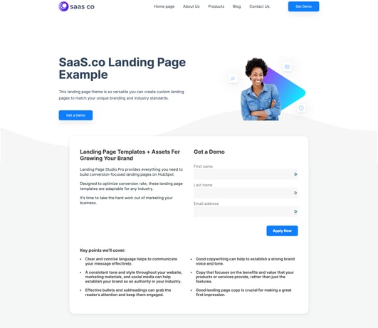
HubSpot is an all-in-one marketing and sales software platform that provides an awesome set of tools for your marketing, sales, service, and business operations. Landing Pages are a foundational tool inside of HubSpot, and one of the best ways to get inbound leads added into your contact list.
One of the key benefits of using HubSpot landing pages is that when someone fills out a form on a HubSpot landing page, they are automatically created as a contact in the CRM. This means that businesses don't need to set up complex integrations to capture lead information. The data captured on the landing page is automatically synced with the contact record, including all properties that are filled out in the form, allowing businesses to track leads and take action on them.
In addition to lead capture, HubSpot landing pages are literally a gateway to an entire world of lead nurturing and sales insights. Simply by having someone fill out a form on a landing page, that can trigger automations like emails, notifications, lead routing, personalization, list segmentation, and so on. This means that businesses can set up simple or complex workflows that automatically take action based on a visitor's behavior on the landing page. For example, businesses can set up workflows that do the following:
- Assign the contact to a sales rep based on their region.
- Notify the sales rep of a new lead.
- Deliver the a specific person’s calendar for booking a time on the thank you message.
- Send a follow-up series of emails every 5 days from the sales rep assigned.
- Create a deal in your sales pipeline with an estimated dollar amount that updates your monthly sales forecast and quota.
- … and that’s just the beginning!
Another key benefit of using HubSpot landing pages is that they can be tied to specific marketing campaigns you might be running. By linking landing pages to specific campaigns, businesses can see which campaigns and strategies produced the most amount of revenue or leads in retrospect. This helps businesses to optimize their marketing efforts and improve their overall ROI.
Also, HubSpot landing pages live inside of “themes” which can match the rest of your brand’s website. This means that businesses can create a consistent look and feel across their site and landing pages, which can help keep visitors attention and to build brand recognition and trust.
Key Features Of HubSpot Landing Pages
Aside from being able to automate so much of your operation and shave hours out of your week, there are several key benefits that using a landing page in HubSpot will provide. These are just some of our favorite, but in full transparency, it doesn’t even touch the total number of features you have at your finger tips.
Drag-and-Drop Editor
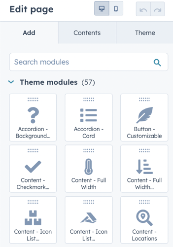
One of the key benefits of using HubSpot's landing page tool is it works inside an entire suite of tools for the CMS Hub called themes. Themes allow you to have a cohesive look across your entire web platform experience, and you’re able to easily edit and create pages using the drag-and-drop editor for all page types. With this editor, you can easily add and edit modules, copy and clone entire sections to be used elsewhere on other pages, and preview your changes in real time. It is designed for even the most beginner-level of user and requires no code experience whatsoever to build beautiful pages. This means you can quickly and easily create landing pages that match your brand and messaging.
A/B Testing
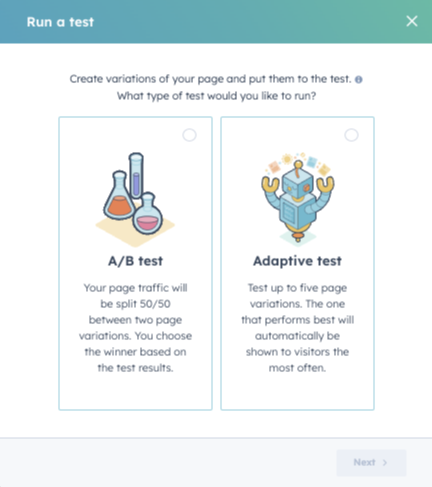
Another powerful feature of HubSpot's landing page tool is A/B testing. A/B testing allows you to test different versions of your pages to see which one performs better. You can test different headlines, copy, images, and CTAs to determine what resonates best with your audience. By conducting A/B tests, you can optimize landing pages and improve your overall conversion rate.
HubSpot makes A/B testing easy by providing a simple interface to create and run tests. You can set up multiple variations of your landing page, set the percentage of visitors that see each variation, and track the results in real-time. This allows you to quickly identify the best-performing version of your landing page and make improvements based on that data.
Personalization
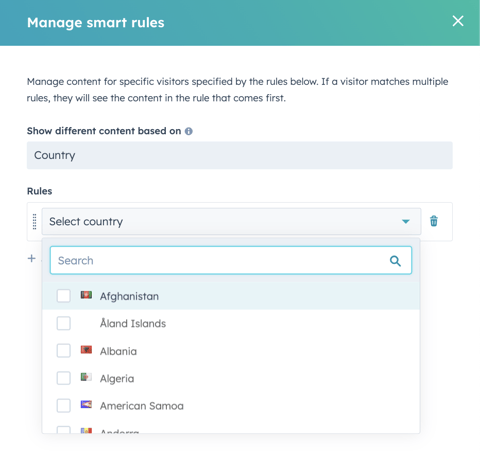
After a bit more experience inside of HubSpot, you may find yourself wanting to customize the journey that your visitors have with you. HubSpot's landing page tool allows you to personalize your landing pages based on a visitor's behavior, location, list membership, and more. This feature is called "smart content". By using smart content, you can create a more personalized experience for each visitor, increasing the likelihood of conversion.
Smart content allows you to show different content to different visitors based on their location, device, referral source, and several other factors. For example, you can show a different headline or image to visitors coming from social media than to those coming from a search engine. You can also use smart content to show different CTAs or offers based on a visitor's behavior on your site. This can help to increase the relevance and effectiveness of your landing pages.
HubSpot Landing Page Best Practices
So now you’re ready to build your own landing page, eh? NOT SO FAST! Let’s cover just a few best practices that will ensure our landing pages are awesome and help us reach our business goals just a little faster.
Here are HubSpot best practices to boost your LP performance:
Choose the Right Theme or Template
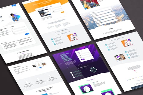
It goes without saying that if you don’t take care of the basics, you’re going to fail miserably. I mean, how do you expect to throw the 40 yard touchdown pass if you can’t even figure out blocking and pass protection? Choosing the right theme or template is essential to creating an effective landing page. Make sure you choose the right template inside your theme for the page you’re trying to build for. Don’t force a square peg into the round hole, either. If it’s going to make you work a lot harder to make the page do what you’re looking to do, you’re probably using the wrong one. If you're using HubSpot, you likely already have a core theme that your portal is using. If not, check out the list of free professionally designed landing page templates we have for you here.
Keep it Simple
Simplicity is key when it comes to landing pages. Don't clutter your page with unnecessary elements that distract from the offer. Keep the design clean and easy to read, and focus on the essential elements. This will help visitors to quickly understand the offer and increase the likelihood of conversion.
Be Consistent
Consistency is key when it comes to building trust with visitors. Make sure the messaging and design of the landing page match the ad or email that brought visitors there. This will help to reinforce your brand identity and build trust with visitors.
Optimize for Mobile
More and more people are accessing the internet on their mobile devices, so it's crucial to ensure your landing page is optimized for a mobile experience. Ensure that your landing page is mobile-friendly and loads quickly on mobile devices. You might be surprised how many people will actually engage with you on their mobile devices… so make sure your website doesn’t look silly when you test it out!
Test and Iterate
This is often the most overlooked part of launching new website pages. Continuous testing and optimization are essential to improving the performance of your landing page. But when you launch a page and just leave it sitting, you’re doing nothing than allowing an educated guess you made when you built the page guide and determine your entire success factor after it launches. What happens if you make minor adjustments shortly after launch based on the data you’re reviewing? How many new leads and potential customers might that bring? A/B testing is a great way to identify areas for improvement and make data-driven decisions about your landing page. Use the data you collect to make improvements and iterate your landing page over time.
Make the Page a Dead End
When it comes to landing pages, less is often more. You want to eliminate the number of distractions on the page and keep visitors focused on the offer. This means you can ideally remove any links or navigation that might take visitors away from the overall goal of that page… completing the form. Make the page a "dead end" by providing only one clear call to action and path to success. Their choices are either to complete the form or press that back button. This will help to increase the likelihood of conversion and drive better results.
Following these HubSpot landing pages, best practices will ensure you're doing all the right things as you're working on various landing pages (or a new landing page) over time.
How To Build A Landing Page On HubSpot
Let’s get started shall we? Here is a step-by-step guide to create a landing page in HubSpot:
- Log in to your HubSpot account.
- Navigate to the Marketing tab in the main navigation menu.
- Click on the "Website" option and then select "Landing Pages" from the dropdown.
- Click on the "Create landing page" button to start creating your page.
- Choose a theme and a template to get started with. Pro Tip: If you don’t like what you see in your list of options, use one of our free themes to get started!
- Customize your landing page by adding text, images, and other elements.
- Add a form to your landing page by clicking the "Forms" tab and selecting the form you want to use.
- Customize the form by selecting the fields you want to include.
- Set up your form confirmation and thank you message by clicking the "Form options" tab.
- Click on the "Settings" tab to configure your landing page settings, including the URL, page title, and meta description.
- Preview your landing page to make sure everything looks the way you want it to.
- Publish your landing page by clicking the "Publish" button in the upper right-hand corner of the screen.
After publishing, you can use HubSpot's analytics to track your landing page's performance and optimize it for better results.

That's it! You now have a landing page in HubSpot that you can use to drive traffic and generate leads.
Why You Need Landing Pages
In summary, landing pages are an essential component of any online presence and digital marketing strategy. We’ve covered an immense amount of features and benefits above. However, here is a highlight reel of the primary benefits landing pages bring to your website approach.
Increase Conversions
Landing pages are specifically designed to convert visitors into leads. By providing a clear and compelling call to action (CTA) and capturing visitor information through a form, you can increase your conversion rates and generate more leads.
Boost Revenue
More leads mean more revenue. By capturing lead information through your landing pages, you can nurture those leads over time and convert them into paying customers. This can help to boost your revenue and grow your brand considerably faster than relying on traditional methods of lead generation alone.
Grow Your Business
Landing pages can help you grow your business by generating leads and expanding your customer base. By making landing pages that are targeted to specific audience segments or marketing campaigns, you can attract more leads and expand your reach.
Increase Brand Awareness
Landing pages can also help to increase brand awareness. By creating landing pages that are consistent with your brand messaging and design, giving away valuable resources and content upon form submission, sharing valuable assets within your strategy, etc., you can reinforce your brand identity and build trust with your customer base. This can help to increase brand recognition and generate leads over time.
Track Your Success
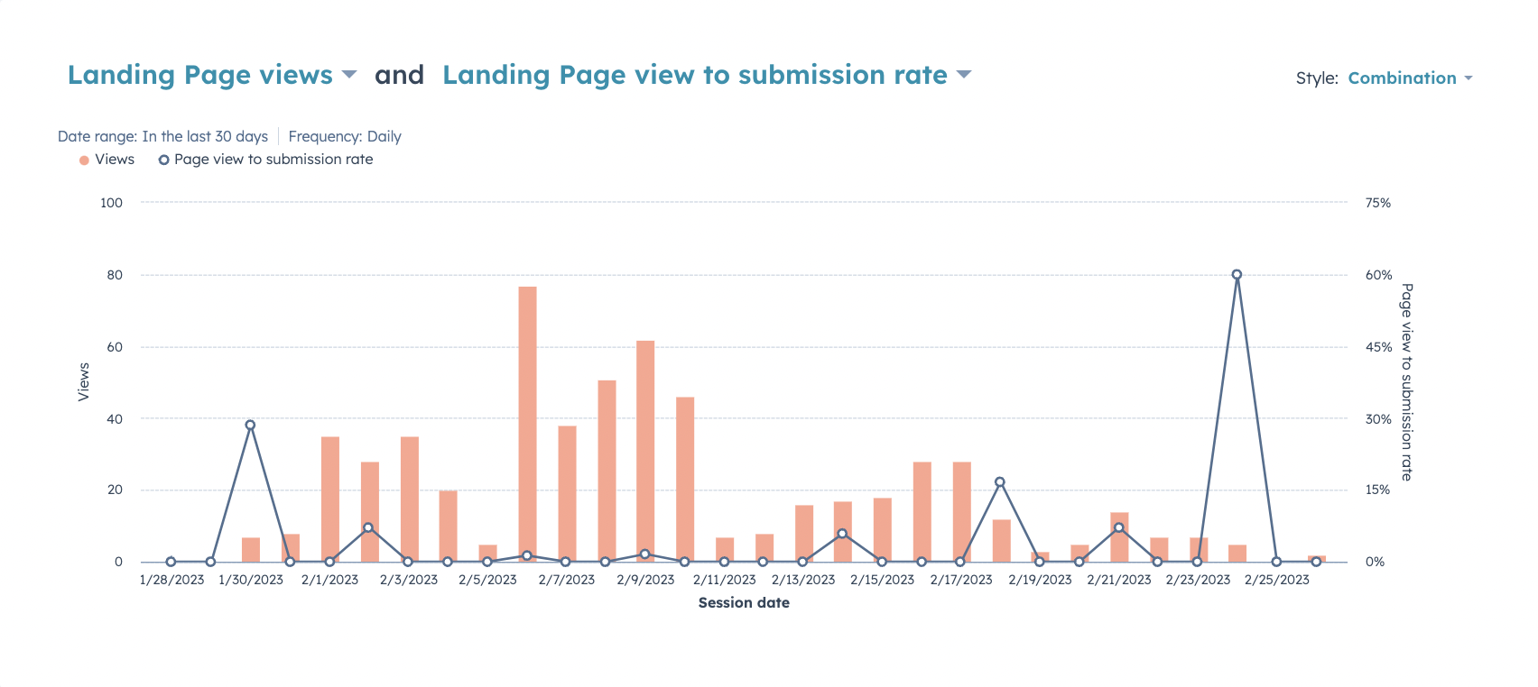
Landing pages can easily be integrated with analytics tools to track your success and optimize your campaigns. Or, if you’re using a tool like HubSpot, that data just automatically shows up for you without any extra effort required. By tracking metrics like conversion rates, click-through rates, and bounce rates, you can identify areas where you can improve your landing pages and increase your overall conversion rates.
Create a Better User Experience
Finally, landing pages can help to create a better user experience for your visitors. As a UX focused brand, we can’t emphasize enough the impact that a user’s journey has on their impression if you. By providing a clear and compelling message, capturing visitor information through a form, and seamlessly delivering value over and over again, you can create a beautiful and easy-to-use experience that is more likely to re-engage and nurture your leads into customers in a much shorter amount of time.
