UPDATE: SYMPHONY WINS HUBSPOT IMPACT AWARD FOR BEST WEBSITE DESIGN!
New York and Paris have Fashion Week. The film industry has Awards Season. And for HubSpot partners? Well, we have our own equivalent, called... The Impact Awards. These awards are given out quarterly to agencies who are seriously pushing the envelope and changing the game for design, sales, and growth with the HubSpot platform. And guess what? It's our season, once again!
 We just love the HubSpot Impact Awards. We love being inspired by so many great agencies and seeing the cool new ways people are using the product. When we submit for an award, we think through the following criteria first before deciding whether or not we have something submission worthy:
- Is what we're doing truly pushing the limits of the platform?
- Are the solutions we're showing sincerely unique from other developers and agencies?
- Do we have a "wow" factor or an "aha!" moment we just have to share?
- Is what we're doing going to help other agencies stretch themselves and help the partner community move forward as a team?
- Are we showing a new use case of how the product might be used?
The answer to all of these questions today is a solid, "You betcha!" which means it's award time! In fact, we feel the website we are writing about today has such an impact on HubSpot website development, that we think it's something all partners and HubSpot developers can incorporate to make their lives (and their clients' lives) easier.
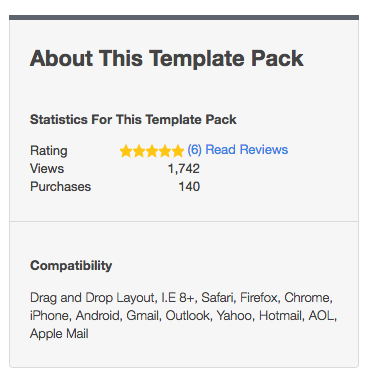 But here's the catch. We're not writing about one website. We're actually writing about 140 websites (and counting).
My friends, I'd like to introduce to you, Symphony.
The Problem
Symphony is a theme that we built for the sole purpose of solving one of the absolute biggest problems with HubSpot websites: Easy-to-edit style changes for an entire website.
Think about that for a second. Prior to Symphony, when you wanted to change a style feature on a page, like making your buttons round instead of square, making your primary colors change seasonally, feature specific elements for whatever reason, etc., one of two things happened:
- Either you changed the style on a page editor (if the option was there for you, most of the time it's not), and then went through every single page and made those style changes happen in every instance (can you say headache?)
- Or, you relied on someone who knew how to code who could hop into the template editor or design manager files to fix your problem for you.
Most HubSpot users don't know how to code, and the thought of hacking away at tiny changes inside the design manager (where you can really mess some stuff up) is what nightmares are made of.
It seems like a minor thing, but it was one of the loudest cries we heard from our clients. Those clients that came from a WordPress-based website were used to seeing things change on a theme editor screen and applied to the entire site, regardless of what level of background they had with coding languages. So, let's look at the issues that we aimed to solve:
The Laundry List
- HubSpot users who don't know code couldn't make style changes without hacking their way through the process, or without paying someone to do it for them.
- Users needed an attractive website that wasn't going to cost them the entire marketing budget for the year. Even DIY templates in the Marketplace were selling for upwards of $1500, before even looking into how much time it would take to implement.
- There are some solutions in the Marketplace that did allow for design changes to be applied throughout the entire site, however you had to style them on an external demo that wasn't even on HubSpot. Likewise, you had to style it using someone else's website's dummy content; you couldn't use your own content to see how changes affected your specific copy and layout. And good luck if you ever need to change anything in the future, because that's a disaster in itself.
- The page editor has, to this point, not been fully utilized as a source for design and control. Users needed to be able to have the ability to turn sections of templates on/off, and be able to design and modify the style internally so it could essentially produce multiple pages that are versatile and unique.
So how did we solve this?
The Solution
We knew in order for this to be a success, we had to build an extremely robust theme inside HubSpot. We also needed it to be easy to use and allow total user control over the styling of the entire website. We had to be very careful about how we approached this to make sure we were solving for the most novice of user. At the root of what we were after was creating a "theme editor" inside HubSpot that allows users to control the appearance of their entire website, while being able to preview their exact changes to their exact content, completely live.
Development Perspective
We explored solutions on other platforms, like how themes are built inside WordPress or other CMS platforms, and our initial thoughts were "gee, it's so easy to style these themes on other systems, and HubSpot has a much better interface with better tools... Why aren't these changes talking to or taking affect on other pages?" Then we started tinkering and experimenting... And the results were music to our ears.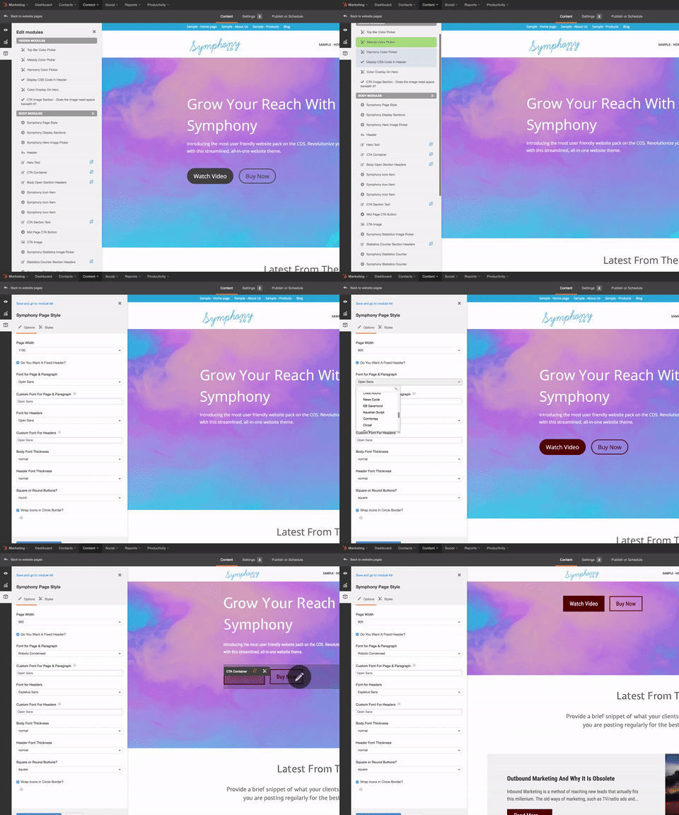
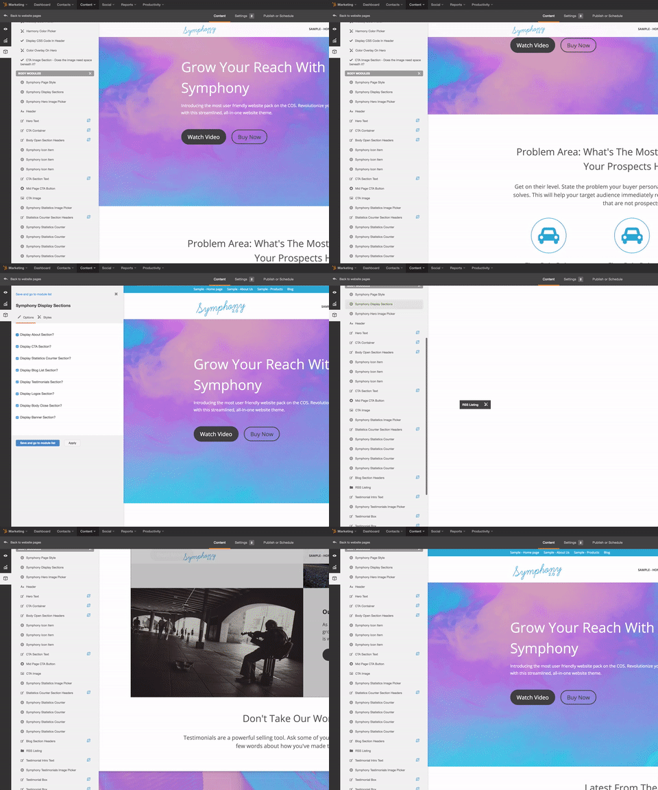
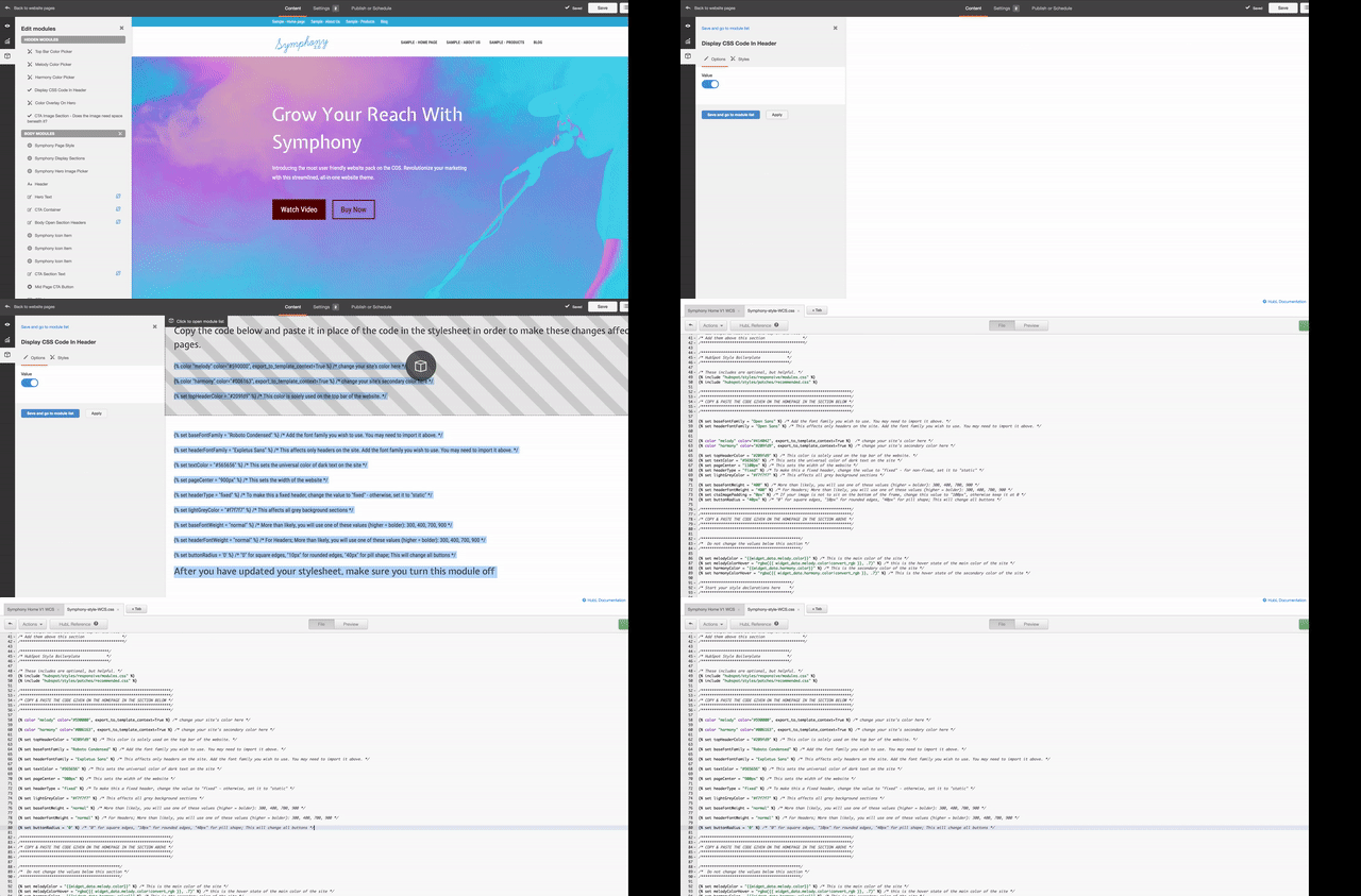
By utilizing a series of modules, we created a theme editor called "page style" within each template to give the user the options to change virtually anything. The changes could be small elements like fonts, colors, button shapes, and gradient overlays, to completely restructuring the layout of a page by removing sections altogether, creating completely unique sites from the same template. Meanwhile, all of this is done without requiring the user to understand code or learn how to use Template Builder tool.
What Sets Symphony Apart From Other Themes
The beauty of this structure resides within the Home Page templates. Once the home page is filled with the user's content, the user can style it as they see fit using their brand's colors and fonts and giving it the look they want.
Then, by simply clicking a button inside a module, all the codes necessary to implement the changes across the entire site are displayed on the page editor preview. The user from that point simply copies that code and is directed to paste it inside the stylesheet in a very clear and explicit location - the only time the user will be forced to see any kind of code to implement sitewide changes, and it's a simple copy/paste. By adding those values, these changes are now applied to every template using this stylesheet, keeping the user from having to make that change every single time they create a new page.
However, that doesn't keep them from customizing their landing pages to fit a different look with each campaign, or specific pages in the website that need to be styled completely differently. Every page has the option of manually overriding the theme style... Something most other prominent CMS platforms won't allow you to do.
Content Perspective
From a marketer's point of view, here is the best part: We structured all of this with the most conversion-focused pre-filled content we could come up with to help qualify visitors, on top of creating this with SEO in mind.
Most business websites today simply talk about the company, how long they've been in business, awards they've won, and are using some slang terminology to describe their product or service in which they came up with to sound cool, but the general public has no idea what it means.
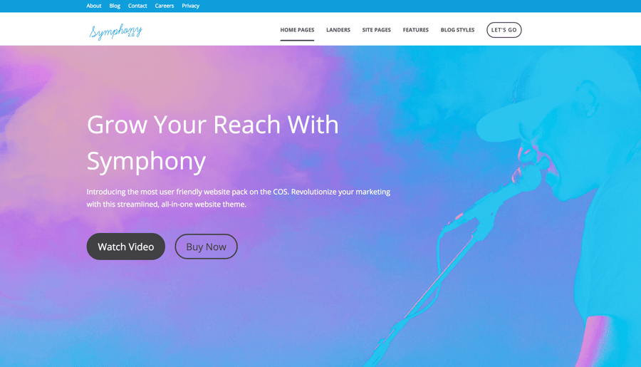
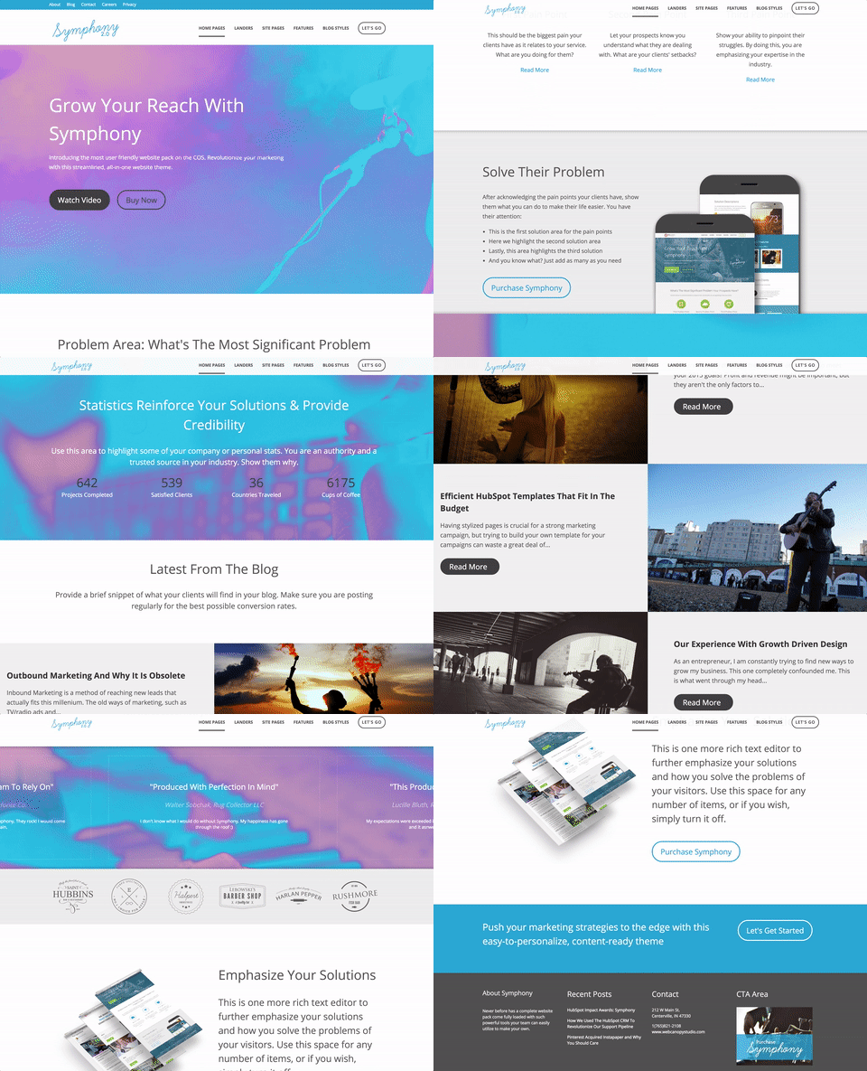
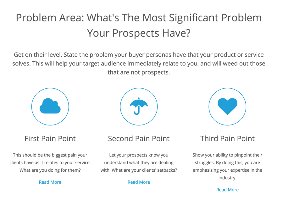
We structured Symphony to walk through exactly what kind of text needs to be placed on a site to increase conversions. We start by looking at what problems their clients have and promoting a clear description of that problem to get on their level. Next, we break it down into pain points of that problem. Then, we explore what solution you might have to remedy their struggle, as if to say "I know the problem you're having, and here are the biggest issues you're experiencing because of the problem. Now, we actually have this awesome product/service that solves all of those pain points for you right away, and here's what it is."
From there, we recommend building authority and showing why you're the best at what you do. We built a statistics section to highlight some numbers and facts about the achievements of the company. We also include a logo section to feature prominent companies that trust you. The last, and really the cherry on top, is a testimonial section for social proof and lending the words of other people to back up why you are trusted in the industry.
See our promotional video of Symphony below.
The best part?
While most comparable template packs run $1200 and up, the entire Symphony pack is available in the HubSpot Marketplace for only $500. This allows companies to build their website on a strong website base without shattering their marketing budget.
The Results
We knew from the start that we had something special on our hands. After running some initial beta testing with users, we started seeing some really cool trends popping up.
First, the amount of support requests for this theme compared to other templates we had in the marketplace has been much lower, decreasing from 35% of template sales to 10% of template sales asking for support. This was important for us to see because it tells us two things:
- It shows us that our templates are user-friendly enough that people are able to navigate and figure out how to use them on their own, vindicating our effort and emphasis on ease of use inside the page editor for design and styling.
- It also showed us that our documentation for common questions or how-to implementation was pretty solid, answering enough questions that people didn't feel the necessity to ask for free support, even though we offer it regularly.
When we looked at the actual results people are seeing using Symphony, we start to see some really valuable trends. Of the client portals we are currently in who are using Symphony, we pulled a mean average of site visits and contacts generated since Symphony was installed. Here is what we found:
- Visits since Symphony was installed increased by an average of 314.96%
- New contacts since Symphony was installed increased by an average of 211.37%

Here is a screenshot of the results from one of those portals. The timeline for this account was from February to August, which are the dates from when Symphony was implemented. You'll see that visits were down slightly, but contacts and customers were both up drastically. That large spike in the summer? That's when they started a heavy inbound approach on top of the site development.
So why does this matter?
Why This Is Impact Worthy
We feel this project is extremely Impact worthy for a few reasons.
- It solves for the user. We have been able to develop something inside HubSpot that lets users design an entire site, styled how they like, and customized to look completely different than every other user, without having to touch the template editor or know how to write code. This is something many have aimed to achieve, and solves one of the biggest problems we see when we talk with people who like other CMS platforms better.
- It solves for the partner community. One important goal of the Impact Awards is to help show partners and HubSpot users alike new and unique approaches to the software toolset. This allows for the partner community to develop and grow together as a whole. Who is pushing the limits of the software? who is testing the boundaries of what can be done and accomplished in different categories? What kind of things are partners coming up with that can be built upon and implemented into the actual product? Symphony has hit on all of these questions and is something to be considered.
- It solves for HubSpot in general. When we show Symphony to people as a demo in our sales process, it's one of the fastest ways we can get them to close into a contract, meaning HubSpot gains more clients. It's a tremendous asset and one of the biggest reasons we've grown to Diamond status in such a short amount of time!
- It helps a lot of people. Most website design category submissions are going to rely on talking through problem solving for a client and building their solutions. We've upped that ante to helping solve problems for over 140 clients using Symphony, and that number continues to grow every single month. That's a lot of websites!
If you're interested in learning more about Symphony you can find more details here!

