To help you get inspired and see what's possible, here are some great landing page examples from different industries, accomplishing different goals. These pages showcase a variety of design elements, copywriting techniques, and conversion strategies that you can adapt to your own landing pages to fit your marketing strategy and improve your conversion rates.
Design Basics
The best landing page design practice is to keep the page simple. In just a few words, explain what is being offered, include relevant images, and a simple form for the sign up process. Utilize eye catching, bright colors for any call to action so that it encourages visitors to click and take action. Of course you can also make use of white space to make elements like your sign up form stand out to visitors. High converting landing pages will tell visitors what is being offered at first glance and convince them to sign up.
Top of Funnel
The goal of HubSpot landing pages targeting top of funnel (TOFU) sales prospects is to attract and engage potential customers who are in the early stages of the buying journey and may not yet be familiar with the company or its products or services. The primary objective of such landing pages is generating leads and building brand awareness by providing valuable information and educational resources that address the pain points or challenges of the target audience.
The landing page typically features informative and educational content, such as a blog post, white paper, e-book, free video, or webinar, that addresses a relevant topic related to the company's industry or target audience. The content is designed to capture the attention of website visitors and provide them with valuable information that helps them better understand their problem or need.
To further engage the visitor, an effective landing page might offer additional resources or incentives. This could include a free trial, consultation, or access to exclusive content or offers. Remember, the value proposition is that they will gain more from this resource than they are giving away in information.
The ultimate goal of the TOFU landing page is to encourage visitors to sign up and provide their contact information in exchange for the valuable content or resources provided. This allows the company to capture the lead and continue to nurture them through targeted email campaigns, retargeting ads, or other marketing tactics designed to move the lead further down the funnel and ultimately convert them into a customer.
Once the form fields have been completed by a lead, they may be directed to a visually appealing thank you landing page with a short video that will remind users of all the major benefits that they will gain from this free resource.
HubSpot's landing page builder allows for easy creation of such pages with pre-built templates, and it also offers the ability to track and analyze landing page performance metrics such as conversion rates, click-through rates, and bounce rates to refine the page and improve its effectiveness over time.
Let’s look at some great landing page examples for common types of top of funnel landing pages.
Lead Magnet
This is one of the most popular uses of landing pages for lead capture. It involves giving away a free “gated” resource like a downloadable checklist or something else that would be of value to your audience.
The primary objective of such a landing page is lead generation and building a marketing database of potential customers who have shown an interest in the company's offerings.
The landing page typically features a brief description of the lead magnet, highlighting its value and relevance to the visitor's needs. The page might also include social proof, video testimonials, or eye catching visuals to highlight the value of what is being given away.
To further incentivize the visitor, the landing page might offer additional bonuses, such as a free trial or a consultation with a specialist, in addition to the lead magnet. The better you can make your value proposition, the higher your conversion rate will be.
The ultimate goal of the lead magnet landing page is to encourage visitors to fill out a lead capture form. This will usually contain form fields requesting contact details like name and email address which can then be used to nurture the lead and move them through the sales funnel.
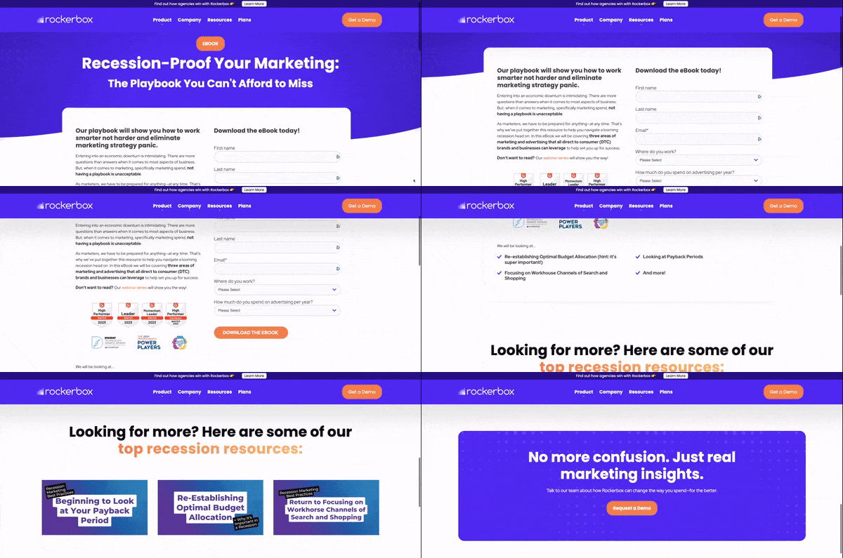
RockerBox: Here's an example of a successful landing page from one of our clients. The color at the top draws your eyes down to the signup form. The form is kept simple and easy to fill out. They use “How much you spend on advertising” as a qualifying question to help them update lead scores for new contacts.
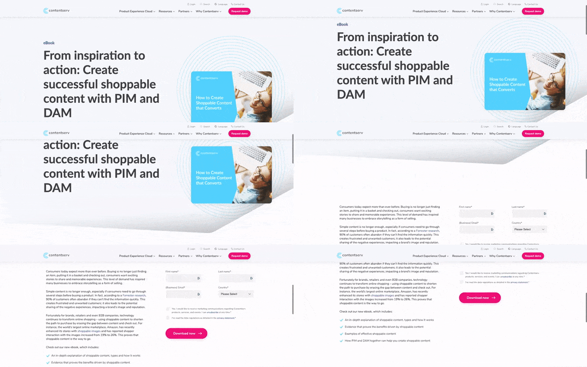
ContentServ: Another one of the great landing pages we've made. This page is for someone who wants to download a white paper. It uses a super basic form that only asks for necessary information which improves conversion rates.
Quiz or Assessment
The goal of a HubSpot landing page with a quiz or assessment is to engage visitors and provide them with personalized feedback based on their responses to a set of questions. The primary objective of such a landing page is to offer an interactive and engaging experience for visitors, while also gathering valuable information about their preferences, interests, or needs.
The landing page typically features a brief introduction to the quiz or assessment, highlighting its relevance and value to the visitor. The page might also include persuasive copy and visuals to encourage the visitor to take the quiz or assessment.
Once the visitor takes the quiz or assessment, they are typically presented with personalized feedback or recommendations based on their responses. This feedback can be used to help the visitor better understand their needs or preferences, and can also be used by the company to further personalize their marketing efforts and qualify leads.
The ultimate goal of a quiz or assessment landing page is to engage visitors and gather valuable data about their interests or needs, which can then be used to nurture the lead and move them through the sales funnel.
.gif?width=600&height=268&name=ecommeleon%20quiz%20(1).gif)
This is a different kind of landing page example because they use a Typeform integration with HubSpot for their quiz. The results of the quiz will automatically be updated in the HubSpot portal from Typeform.
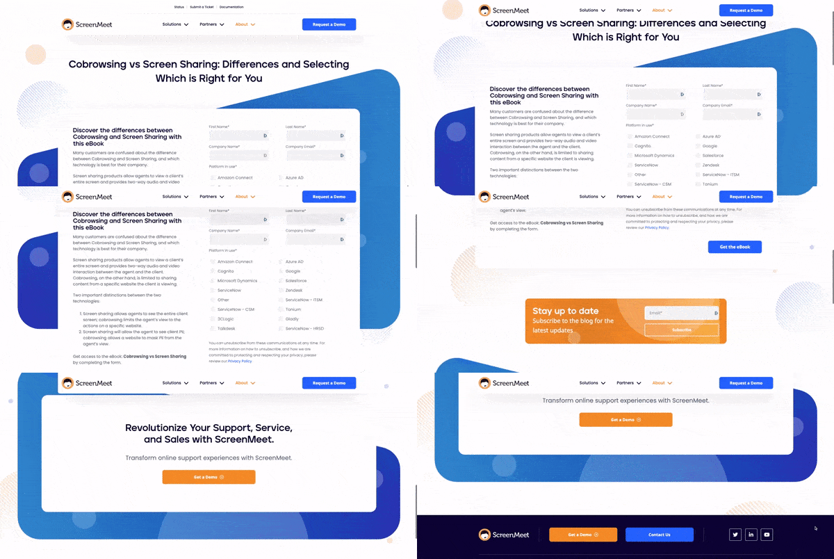
ScreenMeet uses their landing page form as a comparison guide, similar to a quiz. This landing page example looks great and the form has really good qualifying information to be used by their sales team.
Webinar or Masterclass
A webinar focused landing page on HubSpot is designed to achieve a specific goal - to encourage visitors to register for a particular webinar. The primary aim of such a landing page is to generate interest and excitement about the webinar and persuade visitors to provide their contact information, typically their name and email address, to sign up for the event.
The key goal of a webinar focused landing page is to drive conversions and maximize attendance rates for the webinar. This is achieved by providing detailed information about the webinar, including its topic, speaker(s), date, time, and duration. Additionally, the landing page typically includes persuasive copy and compelling visuals to persuade visitors to register for the event.
To further increase the likelihood of conversion, the landing page might also offer additional incentives, such as a free e-book, a discount on a product, or access to exclusive content, to encourage visitors to sign up.
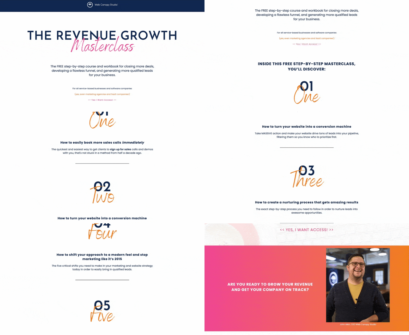
This is our own landing page example from a Masterclass we did. A Masterclass is similar to a webinar, usually with recorded videos and other interactive elements for participants. We’ve had a lot of success with this marketing strategy, running these campaigns internally and for clients.
Case studies
The goal of a case study landing page is to showcase a great example of a company's success stories and demonstrate how their products or services have helped real customers achieve their goals. The primary objective of such a landing page is to persuade website visitors to take action by showing them the value of the company's offerings through real-life examples.
The landing page typically features a detailed case study that highlights a particular customer's challenge, the solution provided, and the measurable results achieved. The case study should provide a clear understanding of the customer's pain points, how the company's products or services addressed those pain points, and the specific outcomes that were achieved as a result.
The landing page would likely also include a call to action, social proof, and visual elements to support the case study and encourage visitors to take action. The ultimate goal of the landing page is to drive conversions, typically by encouraging visitors to request a demo, contact the company for more information, or download additional resources.
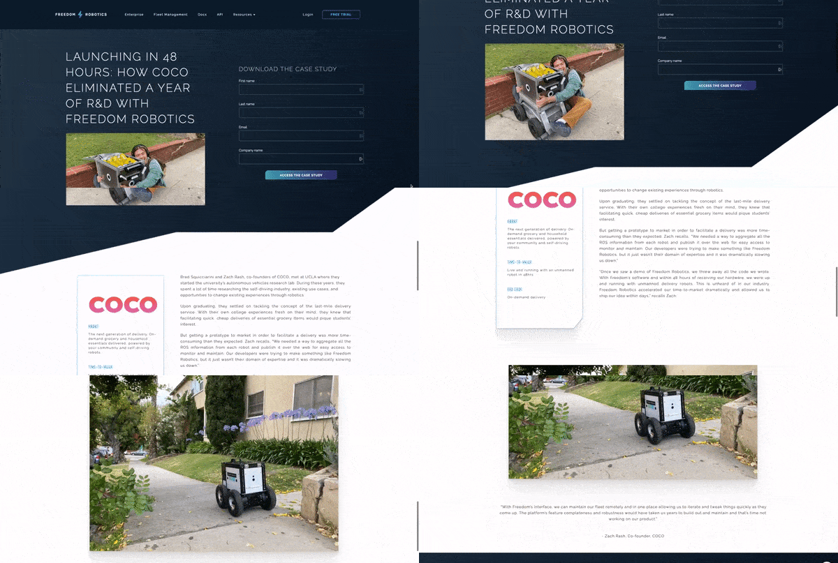
Case studies might be made available to anyone to show your brand's experience. Others want to protect that information and will make them gated content. So only qualified people will explore them like Freedom robotics did with their downloadable case study.
Remember, you’ll rarely go directly from lead to customer. We aren’t trying to sell immediately, we want to nurture our leads and continually provide them with value until they are ready to take the next step. That’s where bottom of funnel pages come in.
Bottom of Funnel
Once we nurture our leads we want to convert them to customers at the bottom of our sales funnel. These pages are meant to accomplish that.
The goal of HubSpot landing pages targeting bottom of funnel (BOFU) sales prospects is to convince visitors who are already familiar with the company and its products or services to take a specific action that leads to a purchase or conversion. The primary objective of such landing pages is to drive sales by providing a potential customer with a compelling reason to buy or take action.
The landing page typically features a clear and concise offer, such as a product demo, free trial, or consultation, that highlights the unique value proposition of the company's products or services. The landing page might also include persuasive copy and visuals to convince the visitor to make a purchase or take action.
To further incentivize the visitor, the landing page might offer additional benefits for making a purchase or taking action, such as exclusive discounts, access to limited-time offers, or a free trial.
The ultimate goal of the BOFU landing page is to encourage visitors to take a desired action, typically by filling out a form, clicking a button, or completing a transaction. This allows the company to convert website visitors into actual customers, driving revenue and growth for the business.
Demo Page
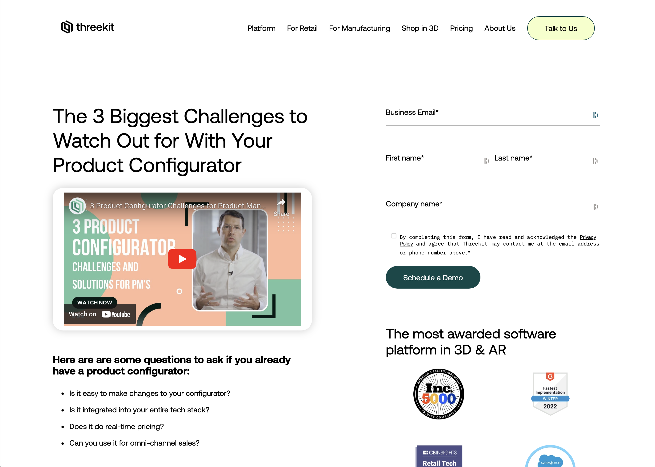
The goal of a demo page is to encourage visitors to schedule a live demonstration of the company's products or services. The primary objective of such a landing page is to provide leads with a hands-on experience of the company's offerings and to persuade them to take action.
The landing page typically features a brief overview of the company's products or services, highlighting their key features and benefits. The page might will also include well written copy, eye catching visuals, and a call to action to convince the visitor to schedule a demo.
The ultimate goal of the demo page landing page is to encourage visitors to schedule a live demonstration, typically by filling out a form with their contact information and availability. This allows the company's sales team to connect with the lead and provide them with a personalized demo experience, ultimately leading to a potential sale.
Contact Page
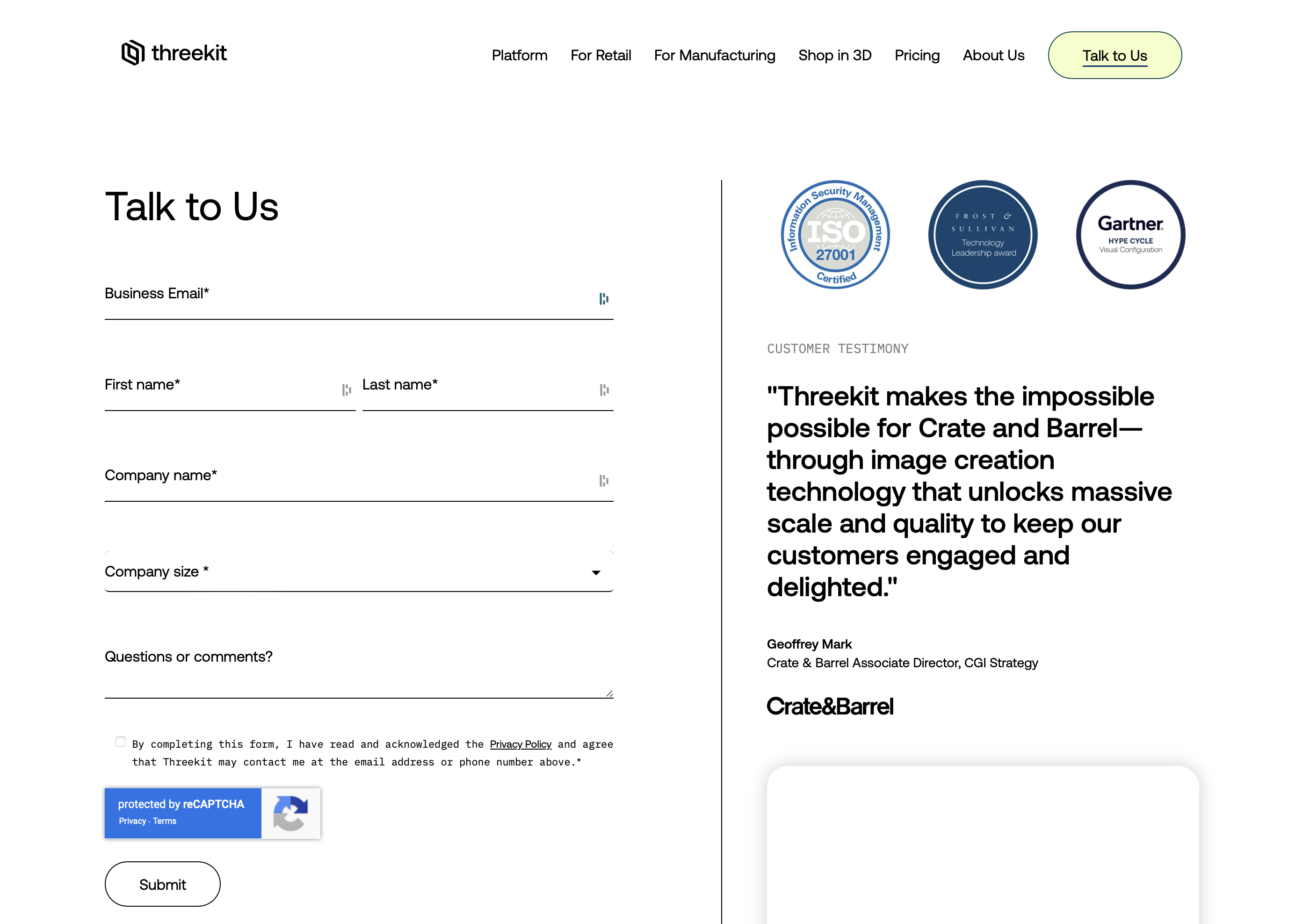
The goal of a contact page landing page built on HubSpot is to provide visitors with a simple and effective way to get in touch with the company. The primary objective of such a landing page is to encourage visitors to contact the company with questions, feedback, or inquiries about their products or services.
The landing page typically features a contact form, allowing visitors to provide their name, email address, and message. The page might also include additional contact information such as a phone number or physical address.
The ultimate goal of the contact page landing page is to make it easy for visitors to get in touch with the company, whether they have a question about a product, want to provide feedback, or are interested in learning more about the company's offerings.
Include:
- Hours of operation
- Contact information
- Privacy policies
- Warranty information
- Social icons
Consultation
The goal of a consultation landing page built on HubSpot is to encourage visitors to schedule a consultation with the company's experts or specialists. The primary objective of such a landing page is to provide potential customers with personalized advice, insights, or solutions to their unique problems or challenges.
The landing page typically features a brief introduction to the company's consulting services, highlighting their expertise and experience.
The ultimate goal of the consultation landing page is to encourage visitors to schedule a consultation, typically by filling out a form with their contact information and availability. This allows the company's experts or specialists to connect with the lead and provide them with personalized advice, insights, or solutions, ultimately leading to a potential sale. We recommend placing a calendar right on the page so leads can instantly book meetings.
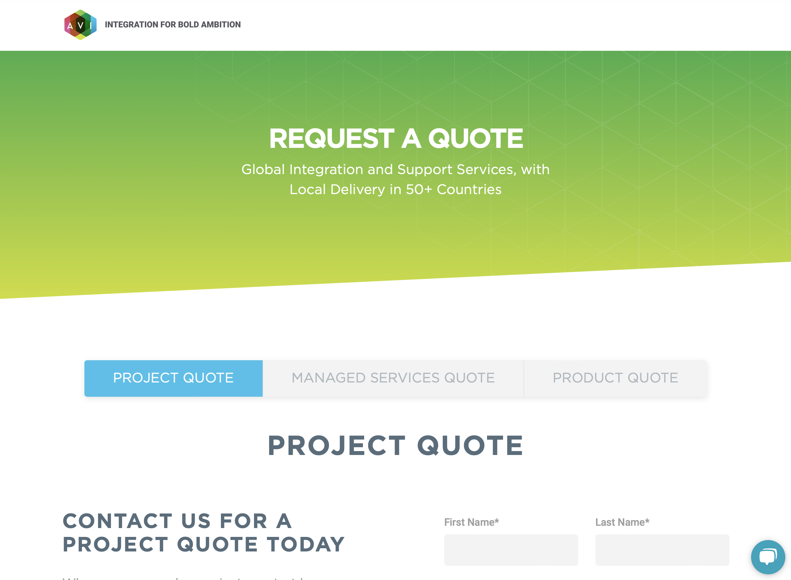
Request a Quote
The goal of a quote request landing page built on HubSpot is to encourage visitors to request a quote for the company's products or services. The primary objective of such a landing page is to provide potential customers with a personalized estimate or proposal for their specific needs or requirements.
The landing page typically features a brief overview of the company's products or services, highlighting their key features and benefits.
The ultimate goal of the quote request landing page is to encourage visitors to request a quote, typically by filling out a form with their contact information and specific needs or requirements. This allows the company's sales team to qualify and connect with the lead and provide them with a personalized estimate or proposal, ultimately leading to a potential sale.
Products Sales Page
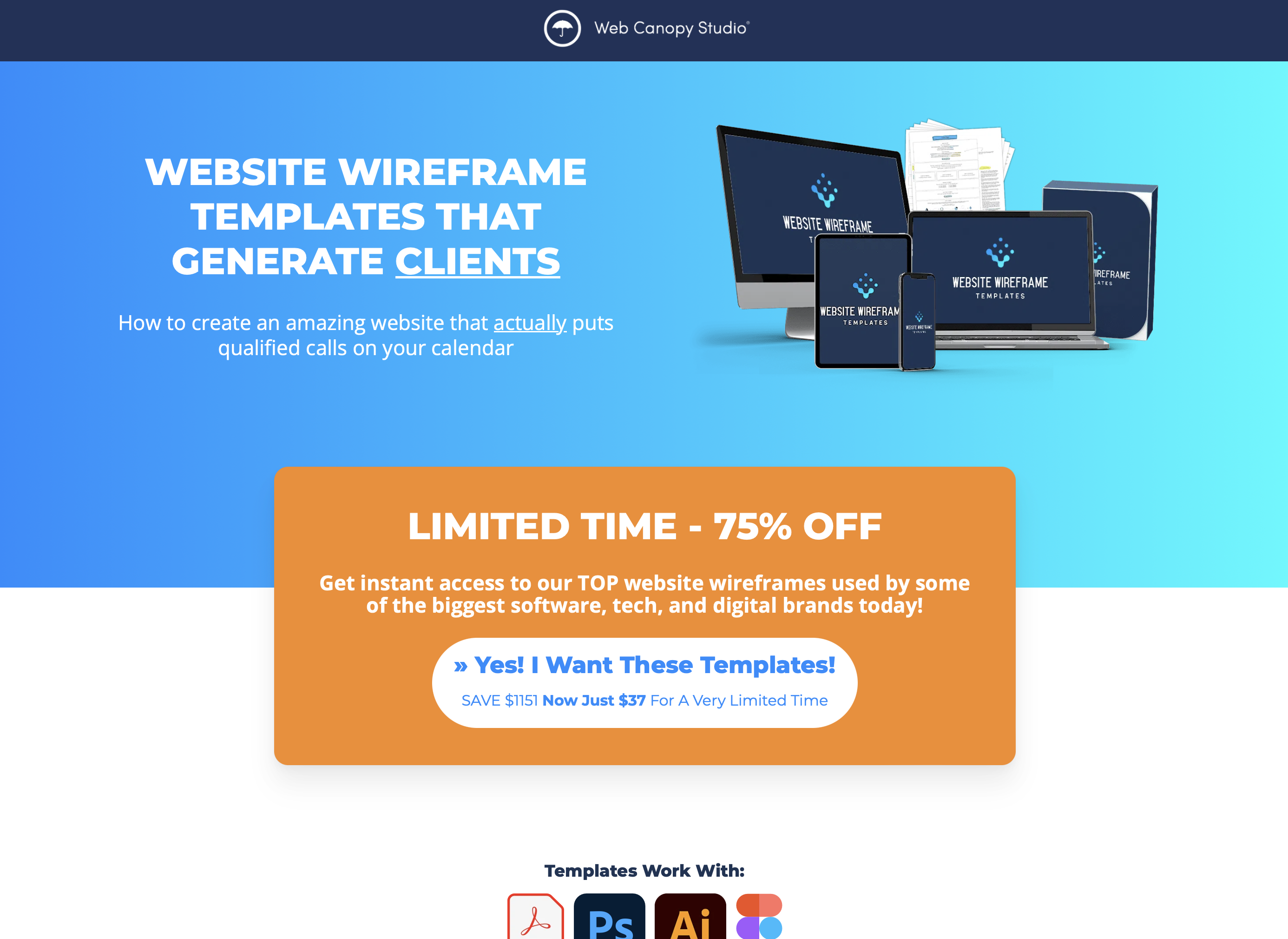
The goal of a sales landing page built on HubSpot is to persuade potential customers to make a purchase or take a desired action related to the company's products or services. The primary objective of such a landing page is to drive sales by providing visitors with a compelling reason to buy or take action.
The landing page typically features a clear and concise offer, highlighting the unique value proposition of the company's products or services. You’ll include many of the things you might cover during a sales call like customer pains, images and/or demo of the product, and potentially a sales letter.
Ultimately, the goal of this page is the sell a product or service without the need of a sales call. This allows the company to convert potential customers into actual customers, driving revenue and growth for the business.
VSL
These are not usually a page that is easily accessible through the website but where someone might be driven to after being nurtured. Add a linked calendar on the page to directly book sales calls on your salespersons calendar.
The goal of a video sales letter landing page built on HubSpot is to persuade potential customers to make a purchase or take a desired action related to the company's products or services through the use of a video sales letter (VSL). The primary objective of such a landing page is to drive sales by providing visitors with a compelling reason to buy or take action through the power of video.
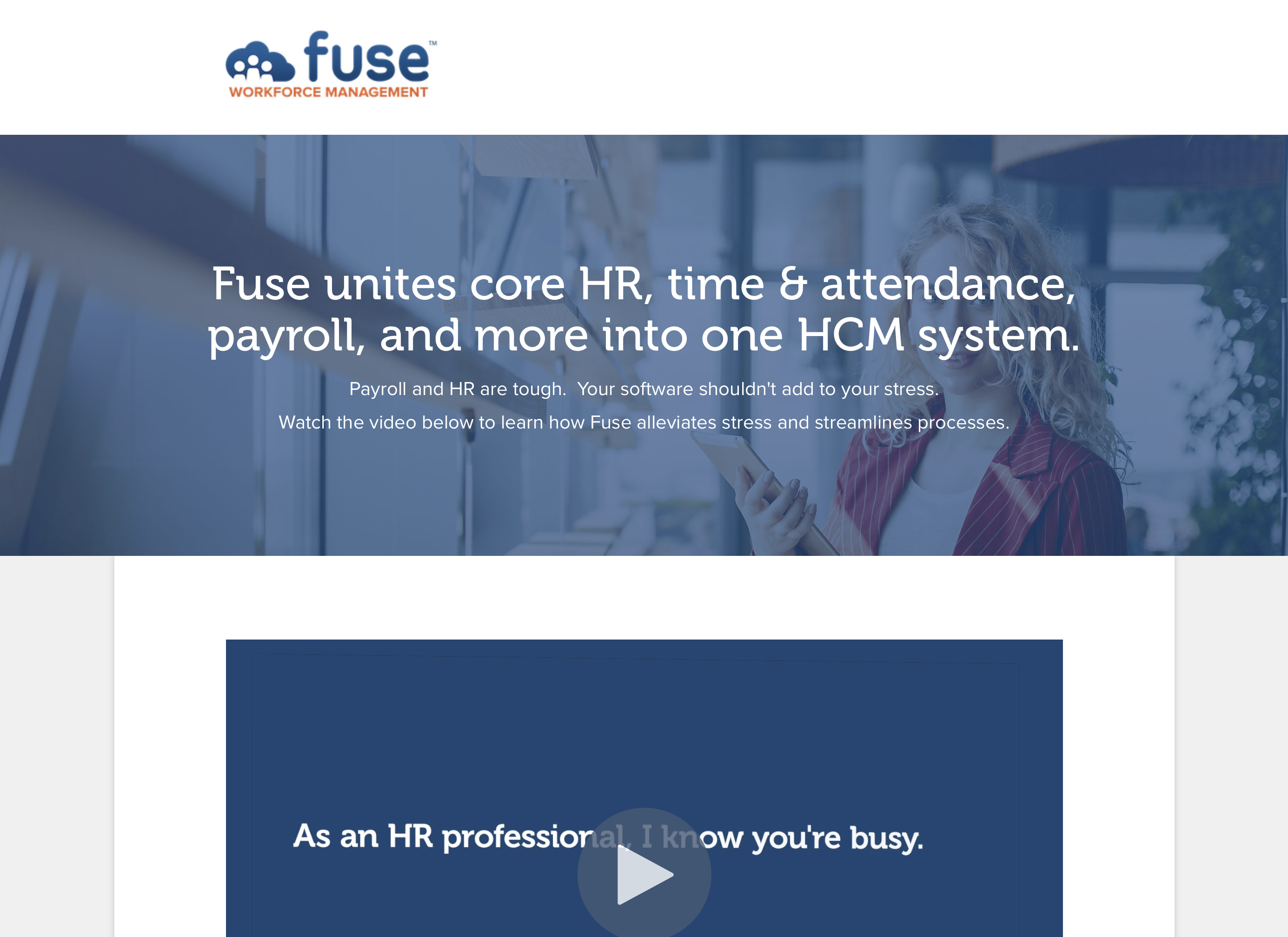
The landing page typically features a video sales letter that highlights the unique value proposition of the company's products or services, as well as the benefits of making a purchase or taking action. The video is typically narrated by a skilled presenter who guides the viewer through the benefits of the product or service.
To further incentivize the viewer, the landing page might offer additional benefits of making a purchase or taking action, such as exclusive discounts, access to limited-time offers, or a free trial.
The ultimate goal of the video sales letter landing page is to encourage visitors to make a purchase or take a desired action, typically by filling out a form, clicking a button, or completing a transaction. This allows the company to convert potential customers into actual customers, driving revenue and growth for the business.
As you can see there are numerous ways to utilize a landing page, but the purpose of all landing pages is to get visitors to complete a singular goal or convert.
If you want to be able to build high performing landing pages of your own, check out our new Landing Page Studio Pro theme in the HubSpot marketplace. It comes with 10 pre-built pages and 50 modules to make whatever you need.
The layouts are based on our proven wireframe templates and based off landing pages we’ve built for our clients, just like the ones I showed you.
Even if you don’t use HubSpot as your primary CMS, you can get access to all these landing pages with marketing hub and be able to easily track all landing page activity and conversions in your HubSpot CRM.
